
Think back to when you first realized how quickly you could assemble a beautiful website with Divi. It felt like the perfect balance between creativity and simplicity. Divi 4 gave everyone fantastic design tools and a smooth visual builder, but we at Elegant Themes were not going to settle.
We’ve listened closely to your feedback and worked hard to improve Divi. Divi 5 takes everything you loved and makes it faster, smoother, and more powerful. It’s designed to help you create with less effort and more possibilities and be future-ready.
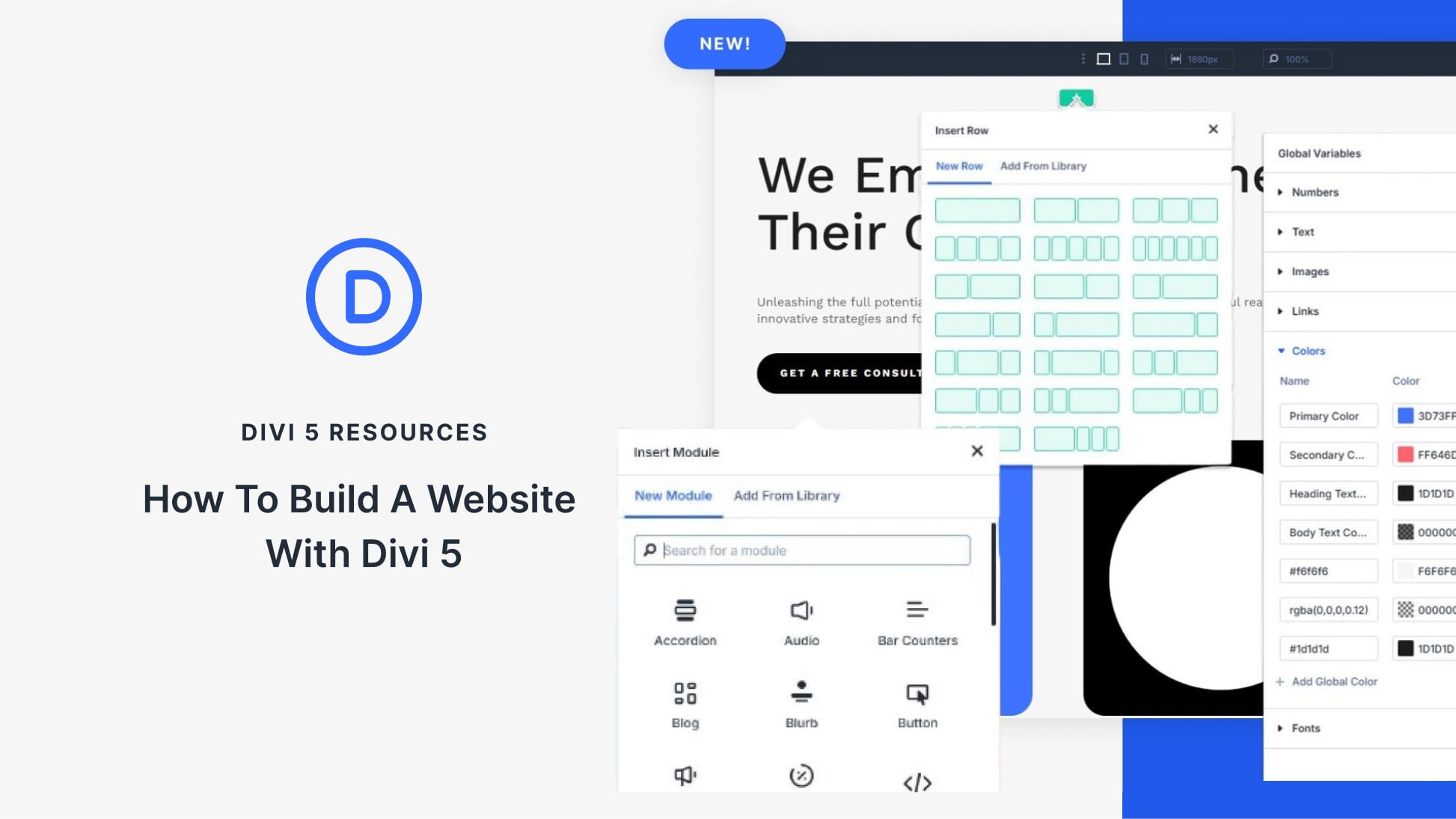
If you want to see what’s new or start your next site, this guide will help you build a brand new website, step by step with Divi 5, and along the way, share practical tips on how to make the best of it. Let’s go!
👉 Divi 5 is ready to be used on new websites, but not entirely ready to migrate existing ones.
What Makes Divi 5 Different?
Divi 5 represents the biggest change to our page builder since we first launched it. We’ve rebuilt it from the ground up with modern web standards in mind. This isn’t just a facelift. We’ve completely rethought how websites should be built with Divi.
The web continues to evolve, with mobile browsing growing and user expectations rising. Divi has always adapted to these changes, and Divi 5 continues this tradition by embracing the latest standards.
When opening Divi 5, you might think, “This looks fresh.” Then you start building, and that’s when you notice it.
“Wait, did that section just load instantly?”
Yes, it did. And that’s just the start.
Divi 5 keeps what worked in Divi 4 but fixes the frustrations you’ve probably learned to live with. We built it because good enough wasn’t good enough anymore, not for us, and certainly not for you. The sites you build today need to do more and load faster.
Let’s explore the key highlights of what the current alpha of Divi 5 ships out with:
From Shortcodes To Block-Based Structure
Divi 4 stored your layouts as shortcodes: those bits of code in square brackets that WordPress reads to create your pages. They worked, but weren’t perfect.
In Divi 5, we’ve rebuilt how your content is stored. No more shortcodes hiding in your database! We now use a clean, block-based approach that better fits WordPress’s direction.
You’ll feel the difference when you edit pages. Click on something, and it responds right away. There is no lag, no waiting for shortcodes to process. Your changes just happen.
While we’ve changed almost everything under the hood, you won’t need to relearn how to build. The visual experience stays familiar. We’ve just made what happens behind the scenes much more streamlined and modern.
The New Divi 5 Interface
Divi 5 introduces a cleaner interface that puts the focus back on your design work. The visual builder now features side panels instead of floating boxes that used to cover your content. This change will make a massive difference in how you work with Divi.
The toolbar has been reorganized. Common actions are now at your fingertips, while specialized tools remain accessible without cluttering your workspace.
Color pickers, typography controls, and spacing adjustments appear contextually when needed.
Text editing feels more natural in this version. You can format content directly on the page with simple controls that appear when you select text. This direct approach speeds up the writing and formatting process considerably.
We’ve also improved how settings are organized. Related options are grouped logically, reducing your time searching through tabs and menus. The entire system feels more cohesive and purposeful. Plus, the light and dark mode options are thoughtful touches that make long design sessions more comfortable on your eyes.
These interface improvements might seem subtle initially, but after building a few pages, you’ll notice how much faster you can work when the tools stay out of your way.
Multi-Panel Workspace
The refreshed Divi 5 brings a fresh take on how you interact with your designs. While Divi 4 gave us an intuitive user interface, the new panel-first layout in Divi 5 arranges them in ways that feel more natural for design work.
Settings now dock neatly along the sides of your screen, giving you an unobstructed view of your page. You can see changes happen in real time without needing to close panels or move them around. This clear view makes precision work much easier when fine-tuning spacing or alignment.
The new multi-panel setup lets you keep your tools spread out but still within reach.
You can pop open your text settings on one side while tweaking spacing on the other. You won’t need to close one thing to work on another.
Breadcrumbs help you navigate between elements quickly. Click to jump from a button to its parent row or section. This saves countless clicks when you’re deep into editing complex layouts.
Some designers prefer settings on the right and others on the left. You don’t have to settle for the option you don’t prefer. Divi 5 lets you choose what feels most comfortable. You can stack them in tabs, too, which helps when juggling many elements.
This may not seem significant, but it could be convenient when building complex layouts like headers, where you need to switch between logo settings, menu styling, and button properties.
We designed the panels to be part of your workspace, not interruptions to it. With Divi 5’s user interface, you can focus where it belongs: on your web design canvas.
Transitioning From Fixed Rows To Nested Rows
In Divi 4, when you try to build something complex, you suddenly hit walls with the section-row-column structure and have to either depend on specialty sections or custom CSS. Divi 5 fixes this headache with nested rows. It might sound simple, but this change completely opens up what you can create without hacking together workarounds.
Now you can click inside any row and add a new row structure in there — no need for specialty sections or writing custom CSS to group your content logically.
This nested row system is just the beginning of our improved layout engine. We’re working on flexbox controls and new row templates that will make specialty sections obsolete. Soon, the flexbox implementation will make responsive designs even more straightforward while giving you better control over how content aligns and distributes across screens.
Other Notable Features
Beyond the major structural changes, Divi 5 has new features that make website building smoother and more intuitive. Let’s look at some standout additions in the current alpha that will change how you work:
- 👉🏾 Design Variables centralize your styling choices and make site-wide changes a breeze. Define colors, fonts, sizes, images, and other elements once, then apply them throughout your site. Need to update your brand colors? Change the variable, and every instance updates automatically.
- 👉🏾 One-Click Editing makes interacting with your content effortless. Just click on any module to edit it. No more hunting for tiny gear icons or settings buttons. This small change saves countless clicks throughout your workday.
- 👉🏾 Canvas Scaling lets you see how your design looks on different screen sizes without switching views. Drag the canvas edge to resize it and watch your layout adapt in real time — perfect for checking responsive behavior without constant tab switching.
- 👉🏾 Advanced Units Support opens up new possibilities for precise, responsive designs. Use CSS functions like calc(), clamp(), and min()/max() directly in Divi’s settings fields to create fluid layouts that adapt perfectly to any screen size.
- 👉🏾 Performance Improvement by avoiding loading unnecessary scripts and modules
- 👉🏾 Customizable Breakpoints expand from just three (desktop, tablet, mobile) to seven adjustable options. This fine-tuned control helps you craft perfect layouts for everything from small phones to ultrawide monitors.
Building A Website With Divi 5: A Step-By-Step Guide
Now, let’s get to the meat of this guide: a practical walkthrough that takes you from blank canvas to finished website using Divi 5’s powerful features. We’ll break down each phase of the process into manageable steps that build on each other
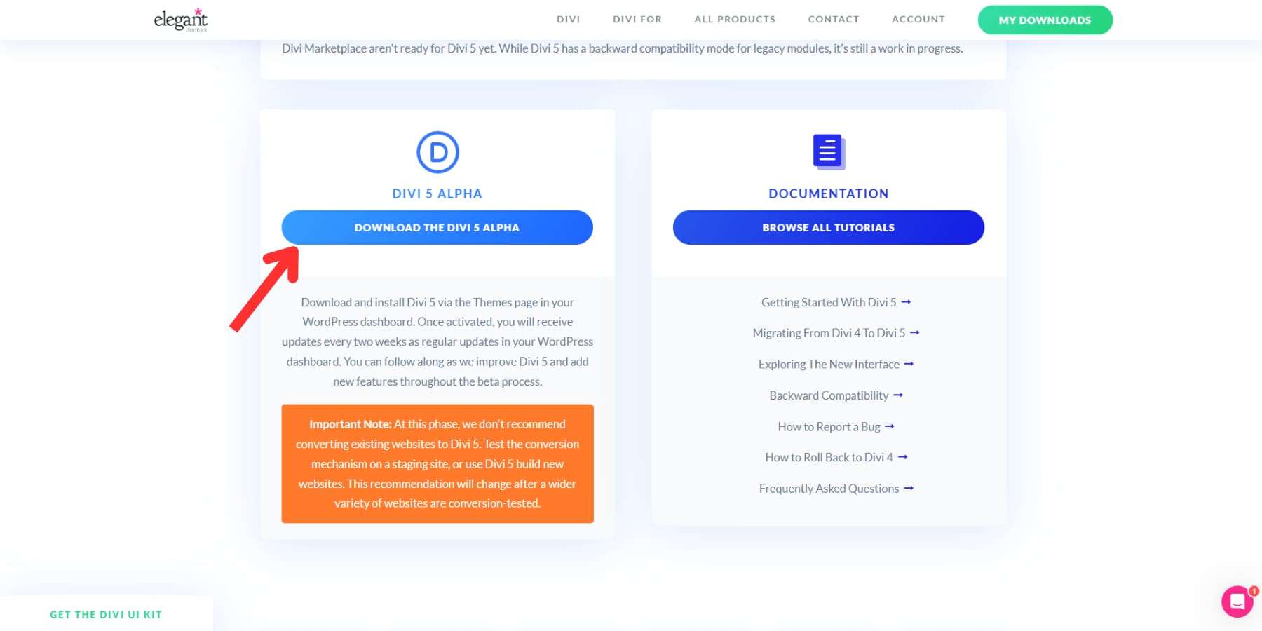
1. Installing Divi 5
Getting Divi 5 running takes just a few steps. Download the latest alpha version from your members area, upload it to WordPress through the theme section, and activate it like you would normally.
2. Customizing Your Workspace
The first thing you’ll notice when opening Divi 5’s Visual Builder is how clean and uncluttered it feels. Floating panels won’t block your view like before. Instead, you’ll find a more thoughtful layout with dockable panels that stay out of your way. Take a few minutes to set up your workspace as you like it.
You can toggle between light and dark mode based on your preference or your work time.
Creating A Workspace That Works For You
Divi 5 offers more than just moving panels around. You can group related panels into tabs, which keeps your workspace organized even when handling complex settings.
Open two different settings panels and drag one onto the other. They’ll combine into a tabbed layout, allowing you to switch between them with a click.
If you prefer a classic setup, you can still float panels anywhere on your screen. Drag a panel away from the edges to detach it and place it wherever you like.
For larger projects, X-Ray mode from the left toolbar can be helpful. It outlines each element with a subtle border, making it easier to spot where sections and modules start and end. This visual guide helps you stay oriented when working with detailed layouts.
Speeding Up Your Workflow
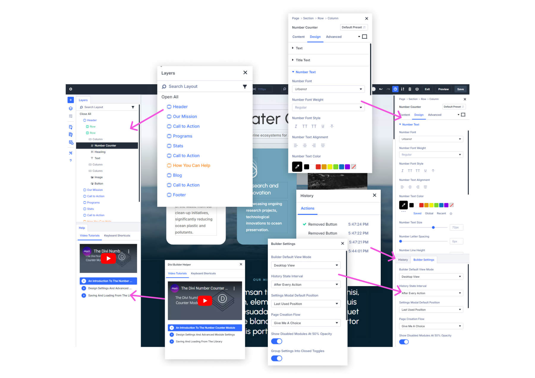
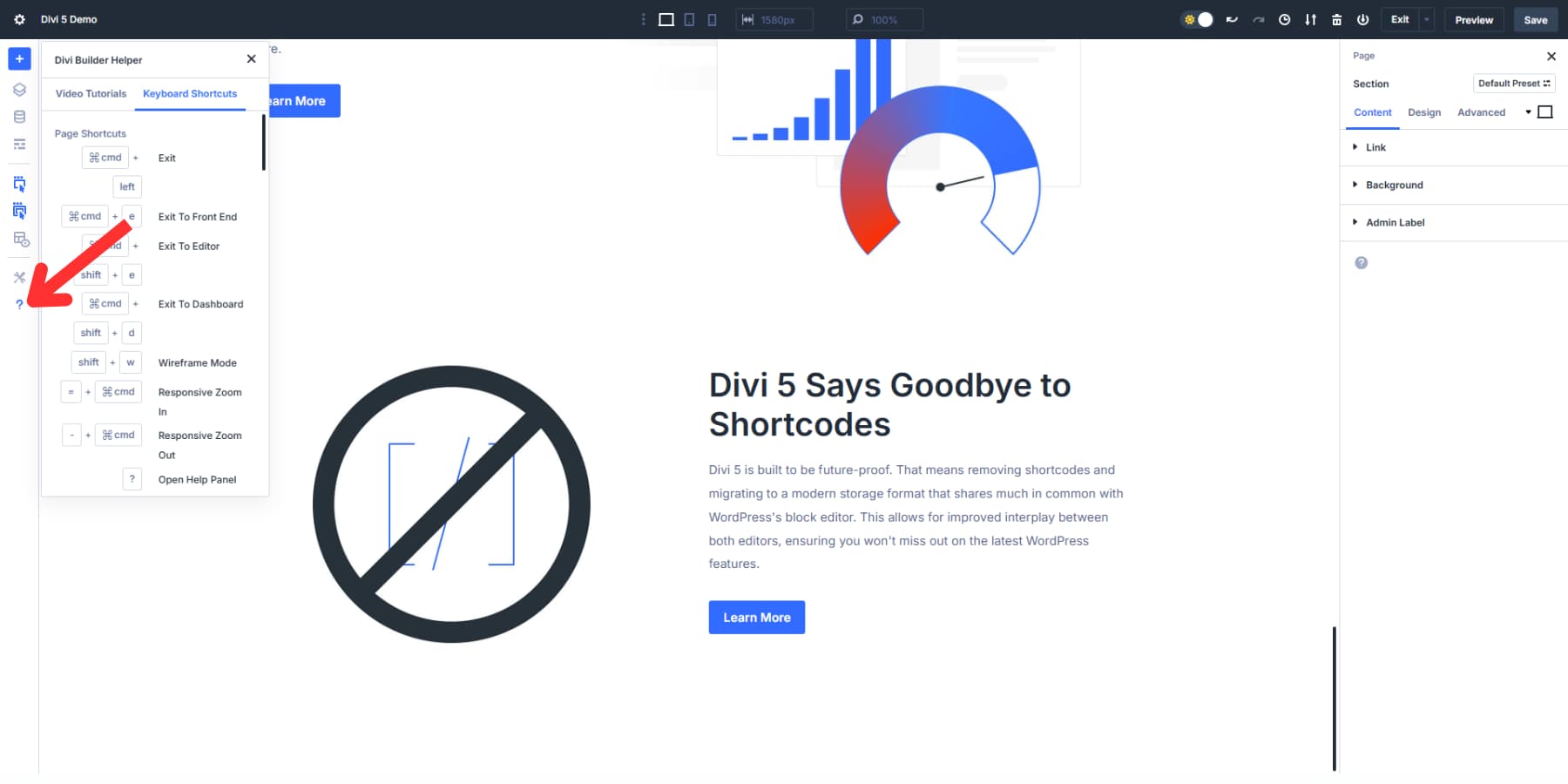
Keyboard shortcuts can dramatically speed up your design process in Divi 5. Press the (?) option to access the help menu, where you’ll find a complete list of shortcuts. Learning just a few key combinations can shave hours off larger projects.
When editing nested elements (like a button inside a row inside a row), breadcrumbs show your exact position in the hierarchy. Click any part of the breadcrumb trail to jump directly to that element’s settings without hunting through layers.
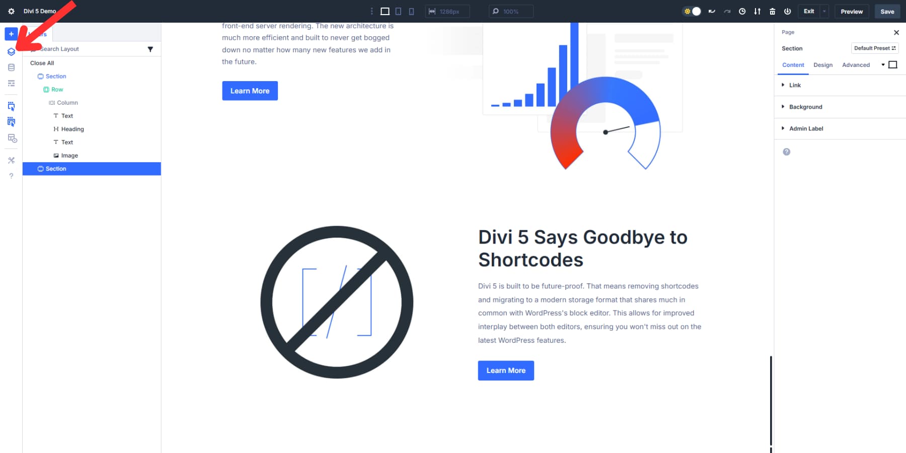
Click the Layers panel icon in the left toolbar to take advantage of it. It gives you a view of your entire page structure as a nested list, making it much easier to select specific elements when working with complex layouts.
2. Setting Up Dynamic Variables
Design Variables in Divi 5 change how you manage your website’s visual elements. They give you a central place to control your site’s design and simplify updating it. Think of them as shortcuts you can use throughout your website.
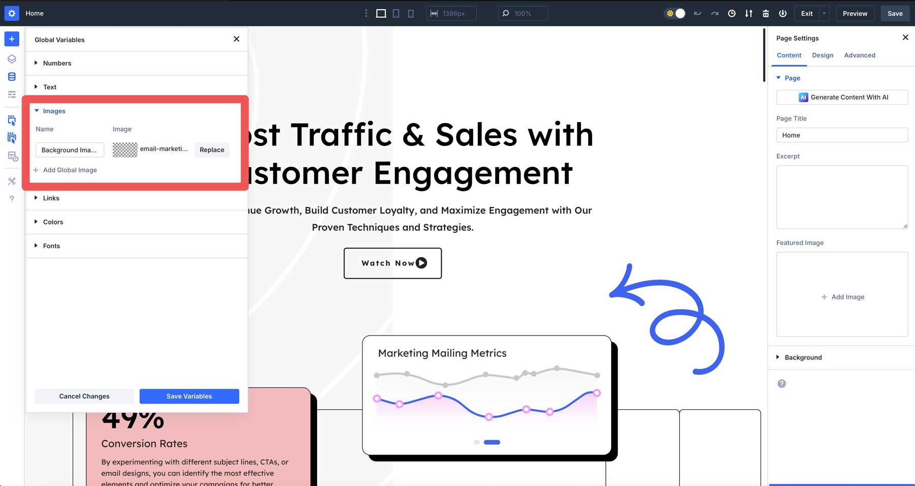
To start using Design Variables, open the Visual Builder and look for the Variable Manager icon in the left sidebar. When you click it, you’ll see options for creating different types of variables: colors, fonts, numbers, images, text, and links.
Setting Up Global Colors
First, set up some color variables. Click on the Colors tab, add your colors, and name them something memorable like “Brand Blue” or “Primary Color.” Click Save, and you’ve created your first variable.
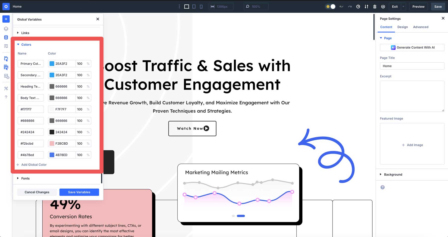
Do the same for your secondary colors, background shades, and text colors. Having all your brand colors saved as variables means you’ll never need to remember hex codes again.
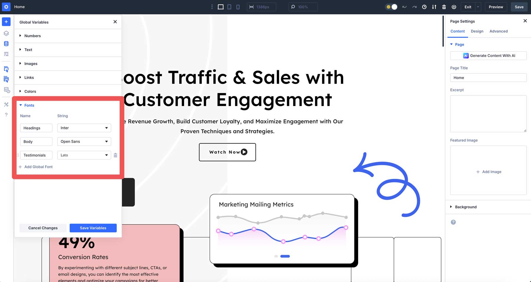
Creating Font and Number Variables
Next, let’s set up your typography system. Under the Fonts tab, create variables for your heading and body fonts. This keeps your text consistent across the entire site.
For number variables, think about common measurements like:
- Standard padding (maybe 30px for sections)
- Border radius (if you want rounded corners)
- Max widths for content containers
- Font Sizes
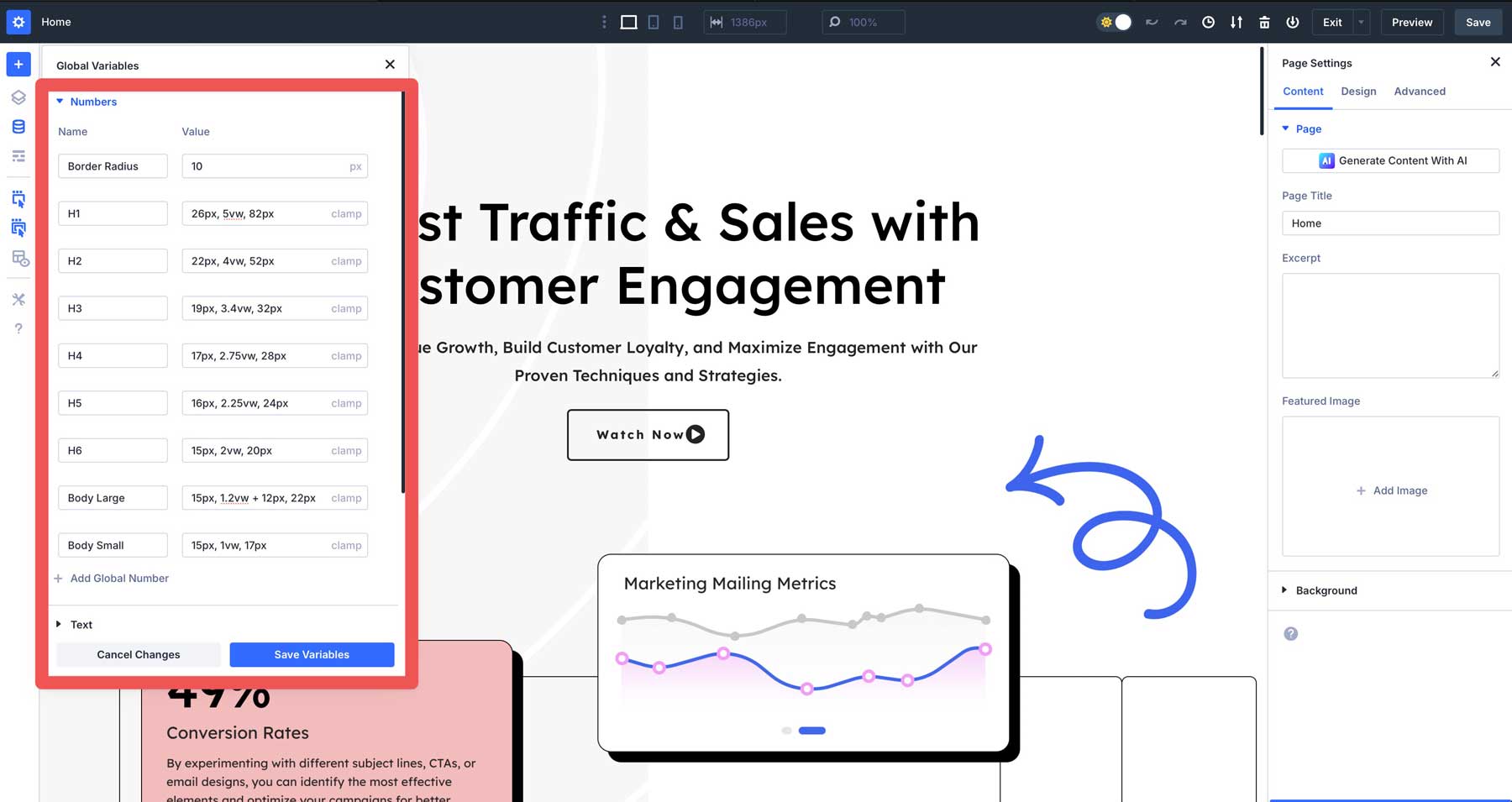
Creating these variables takes a few minutes upfront but saves hours. When clients want changes, you won’t need to hunt through every page, adjusting each element. Just update the variable once.
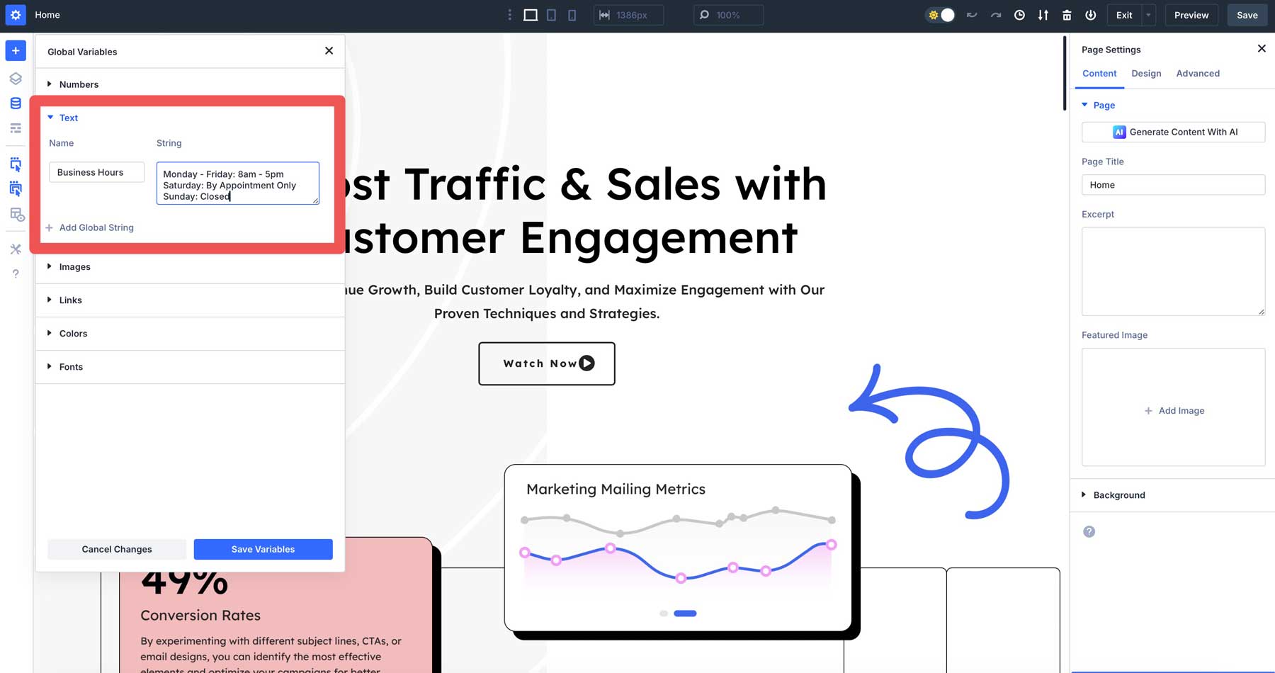
You should also create text variables for content that might change later, such as your phone number, business hours, or company tagline.
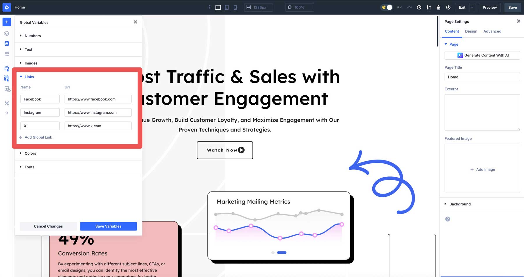
Create link variables with URLs that you can reuse throughout your site, which are perfect for handling commonly used links, such as social media profiles, affiliate URLs, or a “get in touch” button.
Likewise, add image variables for commonly used images, such as logos.
Using Variables with Advanced Units
Divi 5 gets even more powerful when you combine Design Variables with advanced CSS units. Create a number variable using CSS functions like clamp() for responsive typography that scales between screen sizes.
For example, create a heading size variable with: clamp(36px, 5vw, 72px).
This sets your text at least 36px on small screens, scales fluidly on medium screens, and caps at 72px on large screens. Apply this to your heading modules for text that always looks proportional regardless of device.
Combining variables and advanced units removes much of the tedious work of responsive design. Your text and spacing adjust automatically without setting multiple breakpoints manually.
3. Building Pages & Templates With Divi
Now that you’ve customized your workspace and created your design variables, it’s time to build your first page with Divi 5. The Visual Builder gives you several ways to start creating content.
Option 1: Build Your Website With Divi AI
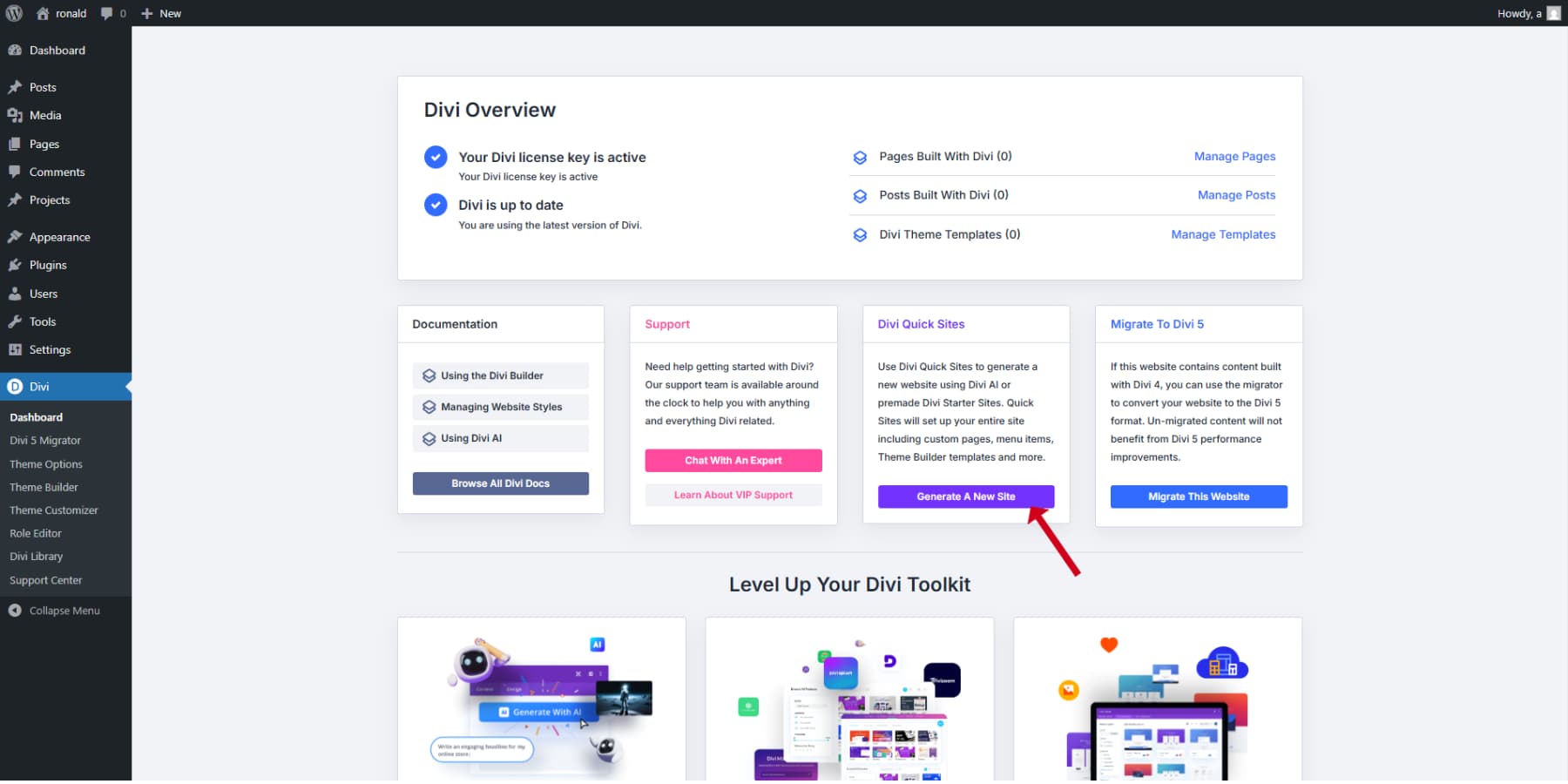
With Divi Quick Sites + Divi AI, you can instantly create a working website featuring multiple pages, Theme Builder layouts, universal design settings, a ready-made navigation bar, and optimized WordPress configurations by providing a basic text prompt.
When building a website with Divi AI, go to your WordPress dashboard and click the Divi icon in the menu. Look for the Divi Quick Sites box and press the “Generate A New Site” button.
Select the “Generate your Site with AI” option and provide detailed information about your business. The more specifics you include about your services, style, and audience, the better results you’ll get. Remember that you’ll need a Divi AI subscription to use this feature.
If you have products to sell, check the install WooCommerce option during setup, and Divi will automatically create your store pages with all necessary components.
For images, you can choose the Divi Quick Sites option to access Unsplash’s collection, let Divi create custom images based on your business description, or select “use placeholder” if you plan to add your own photos later.
You’ll then get to customize colors and fonts. You can either manually select your brand colors and typography if you have specific requirements, or let Divi come up with complementary combinations.
After Divi builds your page, replace any fixed color values with your design variables. This ties your AI-generated sections directly to your design system. If your client wants a darker blue later, you only have to update it once.
If you have not settled on brand colors and let Divi pick for you, and you like the result, make sure to turn those colors into design variables. Also, create global option presets from these colors. This way, your pages stay flexible and cohesive and always match your site’s visual style.
Once you’re satisfied with your selections, hit the “Generate & Publish” button and wait a few minutes while Divi works its magic. Your new homepage will appear, ready to welcome visitors to your site.
Adding New Sections To Your Pages Using AI
Use the “Generate Section With AI” button to generate a new section quickly. You can describe what you need to Divi AI, and it will generate a section for you.
Refining AI-Generated Sections
Once Divi creates your content, you can easily tailor it to fit your needs. Every part of your site remains fully customizable through the usual Divi tools. Change any text, swap out images, adjust spacing, and use your brand’s colors with Design Variables.
These layouts give you a strong starting point, following current web design standards. Instead of beginning with an empty page, you’re working from a well-built template that just needs your unique input. This saves time and effort on design choices while letting you keep full control over the look and feel.
With Divi 5’s improved editing features and the power of AI, building a website becomes faster and simpler. You get quality results quickly and still have the freedom to customize everything, making it ideal for launching professional sites in less time.
Option 2: Build Your Website Using Premade Layouts
To add one of the 2000+ ready-made designs to your page, hit the blue plus button in the top left corner of your screen and pick “Premade Layout.” A window will pop up showing all your options.
Pick a design pack you like. To find something faster, use the filters or type what you need in the search box. Click any pack that catches your eye, then choose which page style you want. You can scroll left to see the full design before deciding.
When you’ve found “the one,” click “Use This Layout.” You might see a message asking about importing color schemes. Just uncheck this if you don’t want it.
The only drawback? You’ll need to repeat this for each page you build. But there’s a better way. With Divi Quick Sites (no AI needed), you can speed this up significantly. The best part is that every Divi user can access Quick Sites and all its starter designs without paying extra for an AI subscription.
Looking at our starter site collection is worth your time. Each one features unique photos and artwork you won’t see elsewhere.
Just head to Divi, click the Quick Sites tab, hit “Generate a New Site,” and choose “Use pre-made starter site” this time. Browse the designs until you spot one that matches your vision. Add your info, pick your colors and fonts, and let the system work its magic.
After A Layout Is Applied…
After you apply or import a premade layout, if you didn’t select your brand colors and just used the default colors and fonts that come with the layout, go through the design and replace any fixed color codes with your Design Variables and Option Group Presets.
If you have selected the colors and fonts but haven’t created the presets yet, turn those colors into Design Variables too. Also, create Option Group Presets from these colors.
This ensures all content from the layout follows your preset styles, so elements like buttons remain consistent across every page. Likewise, you get the convenience of ready-made designs that are easily maintainable and aligned with your brand’s visual language.
You’ll have a finished website ready in minutes. Everything fits together perfectly: colors, fonts, the whole package. After it’s up, you can adjust anything you want, just like with any Divi site.
Option 3: Build Your Website From Scratch
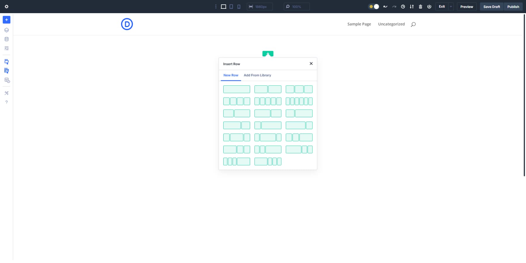
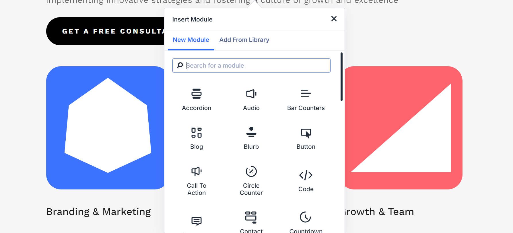
When you open a new page, you’ll see a clean canvas with a default section added. Like Divi 4, you can click the green (+) button to add a new row and start building from scratch.
Just like Divi 4, there is a collection of ready-to-use modules with Divi 5.
The nested rows feature is invaluable for complex layouts. Need a three-row section within one row of a two-row layout? No problem. Click inside your row, add a row, and choose your row structure. Divi 5 handles this nesting without breaking a sweat, giving you virtually limitless layout possibilities.
Let’s see how this could work for a blog layout. Start with a standard two-row setup: wide content area and a narrower sidebar. In the main row, drop your Blog module.
Do you need featured posts in a grid above regular posts? Just nest another row at the bottom with a single row with email opt-in and then a three-row structure for information boxes. The same structure would have required custom code in Divi 4.
For your sidebar, you might want different widgets stacked with different backgrounds. With nested rows, each sidebar element gets its own row with custom styling. Promotions in one look, author introduction in another and, a testimonial in the third, all neatly contained in the sidebar row.
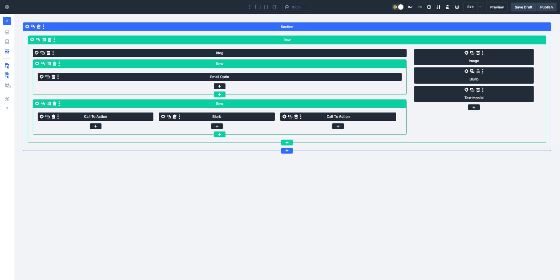
This new structural freedom changes how you approach layouts entirely. Product showcase with alternating text/image rows, then a three-row feature section, topped with full-width testimonials? All in one fluid container without fighting the builder.
Create Option Group Presets
Once you style your first page, it becomes imperative to duplicate these styling choices across each and every page of your website. However, that could be very time-consuming and, more importantly, annoying. Divi 5 introduces Option Group Presets to help speed up your design process. They work like reusable style snippets you can apply anywhere on your site. Let’s look at how to set them up and use them.
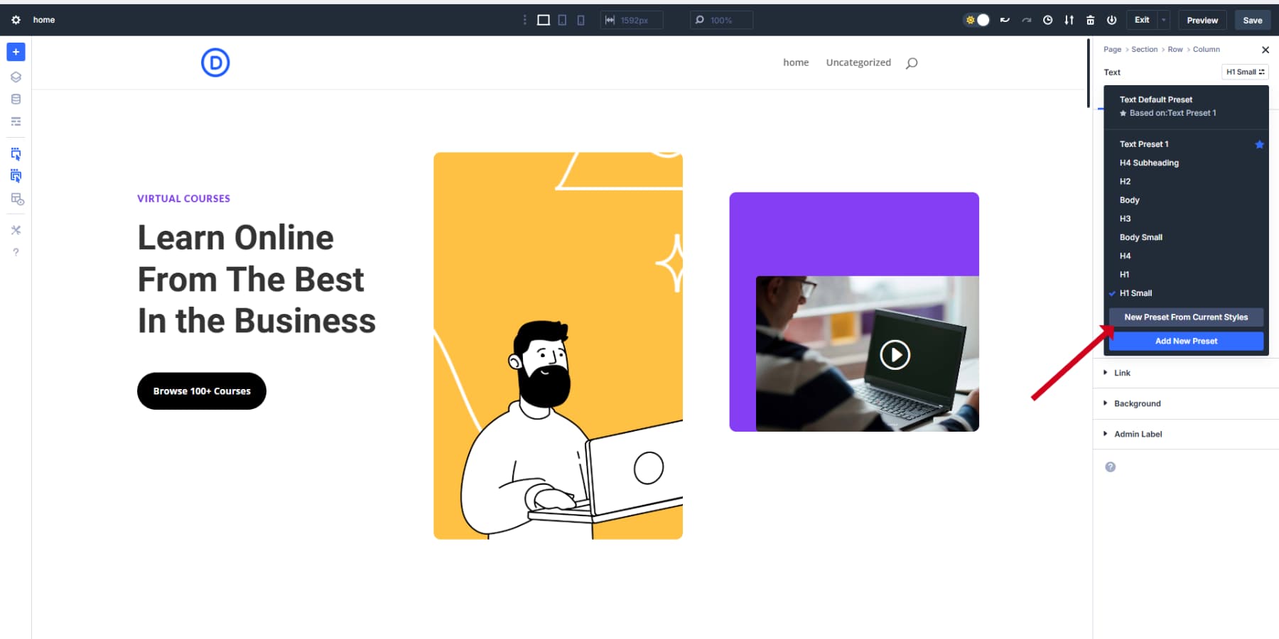
Start by clicking on any module you’ve added to your page. When you’re in the settings panel, look at the design options. Things like borders, typography, or shadows. Hover near the top-right corner of these settings blocks, and you’ll see a small preset icon appear.
Click that preset icon and choose “New Preset From Current Styles.” Give it a name that makes sense to you. Something like “Round Corners” for a border preset or “Big Headline” for text styling.
The panel will change color to show you’re working on a preset now, not just the current element. This helps you keep track of what you’re doing. If this is a style you’ll use often, check the “Assign as Default” box so new elements will use it automatically.
When you save, you’ve created your first Option Group Preset! The beauty is you can apply this exact same styling to any element that uses that option group: text modules, images, buttons, or even full sections.
Combining Option Group Presets With Design Variables
Here’s where Divi 5 gets really powerful. When creating presets, don’t just use static colors or sizes — use your Design Variables instead.
Say you’re making a button preset. Instead of picking a specific color, click the variables icon in the color picker and select your “Brand Blue” variable. Now your preset will always use your brand color, and if you change that color later, all buttons using this preset will update automatically.
The same goes for every variable type you’ve created. Need different spacing? Just grab your saved spacing numbers. Applying fonts? Your typography variables are right there waiting. Your site stays consistent.
When needed, just update the variable once, and it will update every instance on its own, without the headache of hunting down every element when the client wants “that blue to be a bit darker.”
Divi 5 also lets you include advanced units in any size field. Want a section that’s never wider than 1200px but shrinks on mobile? Type “min(1200px, 90%)” in the width box. Done. The container will stay at 90% width until it exceeds 1200px, then stop growing. No custom CSS is needed. These advanced units can also be applied to Dynamic Variables.
Building Element Presets
After setting up Option Group Presets, you’ll want to create Element Presets to save fully styled modules, rows, or sections. Think of these as complete design packages you can reuse across your site.
To create one, completely style a module, and when it looks perfect, click the preset icon in the module’s header (not inside a specific option group). Select “New Preset From Current Styles,” give it a name like “Feature Card” or “Team Bio,” and save.
When adding new modules, simply click the preset dropdown in the module header to apply your saved design instantly. All settings will be applied in one click.
Build Other Pages Based On Your Design System (Variables & Presets)
Once you’ve established your design system with variables and presets, creating additional pages becomes much more efficient. With Divi 5, your foundations are in place, now you can expand your website while maintaining perfect consistency.
Start by creating a new page and activating the Visual Builder. When you add modules to this fresh page, you’ll immediately notice how your preset system speeds things up. Instead of styling elements from scratch, simply apply your saved Element Presets.
For instance, when adding a new Text Module, click the preset dropdown in the module header and select your “Body Text” preset. All styling, including font choices, sizes, and colors, gets applied instantly. The same goes for buttons, images, testimonials, or any other element you’ve created presets for.
Build Your Templates
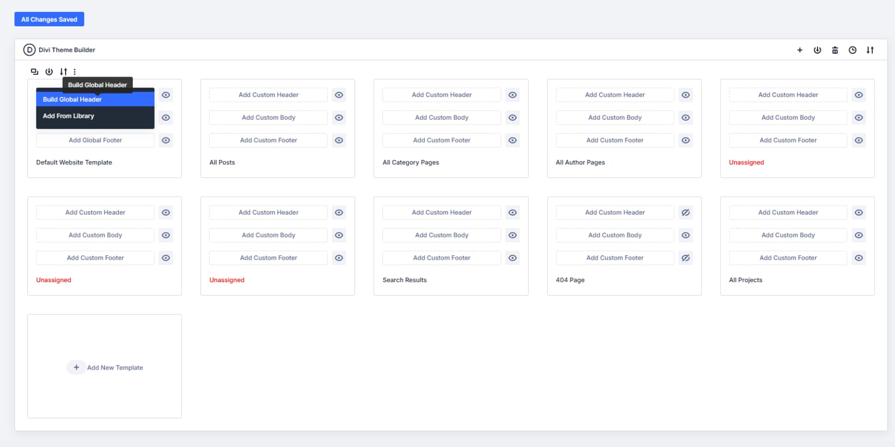
With Divi’s Theme Builder, you can create and customize every nook and corner of your website. Headers, Footers, Post Templates, Custom Post Type Templates, Shop Pages, you name it.
Access Divi’s Theme Builder by navigating through your WordPress dashboard: Divi → Theme Builder. At the top, you’ll find your default template — this template manages the overall look of your entire website. Click on the Add Global Header section and choose “Build Global Header” to open your workspace. Likewise, you may select Add Global Footer to design your website footers.
With nested rows, headers, and footers, building becomes much easier. Need that fancy header with different row layouts in each section? Add a row inside another row, pick your row layout, and keep building.
Create Custom Content Type Templates
Beyond headers and footers, you can design specialized templates for different content types using Theme Builder.
Like how blog posts differ from team member profiles or product pages, each deserves its own optimized layout.
Build a template for blog posts with proper spacing for readability, featured image placement, and author information. Product pages might need gallery layouts and pricing tables.
The beauty of this system is that once these templates are assigned to their respective content types, they apply automatically. For example, if you add a new blog post, the template handles the formatting instantly. This removes repetitive work and keeps everything visually connected.
When building these templates, leverage your Option Group Presets and Design Variables. The typography settings you established earlier ensure headings and body text remain consistent. Your color variables maintain brand identity across all template types.
Using Divi AI For Template Design
Divi AI cuts template-building time from hours to minutes. In Theme Builder, pick what you need — a header, footer, blog layout, or product page.
Hit the blue + button in Visual Builder and select “Generate Section With AI.”
Your description matters most. Be specific about what you need:
- Header: Clean header with left-aligned logo, horizontal navigation menu (Home, About, Blog, Shop), and a clear contact button on the right. Responsive with a hamburger icon for mobile.
- Footer: Three-column footer: company info and social icons, useful links, and contact details (address, phone, email). Clear section headings, simple layout.
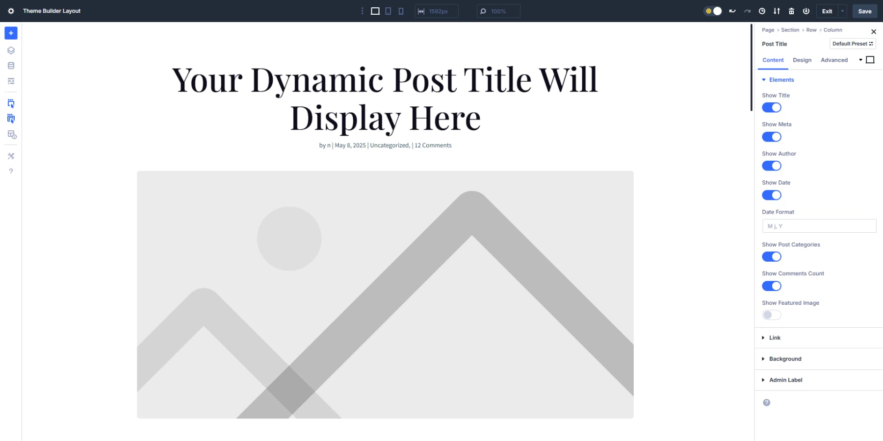
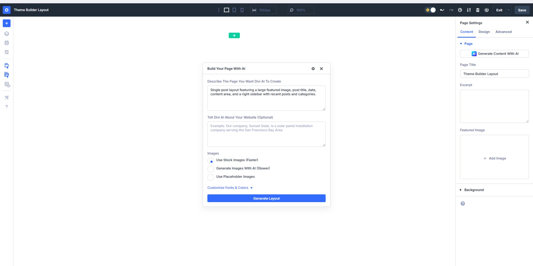
- Blog Template: Single post layout featuring a large featured image, post title, date, content area, and a right sidebar with recent posts and categories.
- Shop Page: Product display with image gallery, product name, price, description, quantity selector, and a prominent buy button. Related products shown below.
The more details, the merrier the results. After Divi creates your template, take a minute to replace all hard-coded values with your Option Group Presets for elements like buttons, text blocks, and borders. This integrates AI-generated content with your preset system, so your buttons look identical across all pages, whether built manually or with AI.
This method gives you ready-made templates that feel custom-built, while keeping everything tied to your site’s visual language. When design changes come later, your AI-built sections update right along with everything else.
Save Time With Advanced Template Features
Templates become even more powerful when you add conditional logic. Want different headers for your shop pages versus your blog? Set display conditions that apply templates based on page categories or URL patterns.
Remember to make templates work hand-in-hand with your preset system to create a comprehensive design framework that makes website building faster, more consistent, and ultimately more professional.
4. Mastering Responsive Design
Divi 5’s responsive design introduces significant improvements over previous versions. The new system provides additional control over how your website adapts to different screen sizes.
Divi 5 introduces an advanced breakpoint system that provides unprecedented control over website responsiveness. The seven customizable breakpoints allow for precise design targeting across different devices:
- Phone: < 767px covers most smartphone screen sizes
- Phone Wide: < 860px covers most phone screens in landscape mode
- Tablet: < 980px is good for most tablet screens in portrait mode
- Tablet Wide: < 1024px is standard for landscape view in most iPads and Samsung tablets.
- Widescreen: > 1280px is a good width for most smaller laptops
- Ultrawide: > 1440px covers larger desktop screens
These breakpoints are meticulously designed to address the diverse landscape of modern devices. This approach allows designers to create websites that look perfect whether viewed on a compact smartphone or an expansive ultra-wide monitor. Each breakpoint isn’t just a technical threshold; it’s an opportunity to craft a tailored user experience.
Plus, when you need, you can adjust the breakpoints as per your needs.
5. Get, Set, Launch!
Your Divi 5 website is built, optimized, and ready to wow visitors. Let’s walk through the final steps to take your site live with confidence.
Run a quick preview tour of your site across different devices. Divi 5’s responsive design capabilities have already done most of the heavy lifting, so this should just confirm that everything looks great. Thanks to the customizable breakpoints, your design adapts seamlessly from phones to ultra-wide monitors.
Double-check your interactive elements. Click through navigation links, submit test messages through contact forms, and try out any specialized features you’ve added. Divi 5’s clean code structure helps ensure these elements work reliably.
Final Polishing Touches
Review your content with fresh eyes. Look for typos or awkward phrasing that might have been overlooked during the build process. At this stage, the focus should be on small refinements, not major changes. When needed, Divi AI is completely integrated in Divi 5 and can be used at any time to generate, modify, or improve any of the text or images.
Divi gives you the power to create pixel-perfect designs, so take a moment to appreciate your site’s cohesiveness before launch. Consistently using your design variables and module presets should create a polished, unified look throughout.
After launch, Divi 5 continues to offer advantages. The speed improvements from its modern framework will help with search engine visibility, and users will appreciate the fast load times and smooth interactions.
Watch which pages get the most traffic and engagement. Use these insights to refine your design or expand on popular content sections. Divi 5’s flexible structure makes these adjustments straightforward.
Combining your creativity with Divi 5’s powerful framework produces a visually impressive website built on modern web standards. Your site is ready to deliver great experiences to visitors while giving you a flexible foundation for future growth.
Build Faster, Better Websites With Divi 5
Divi 5 marks a fresh chapter for website creators. The rebuilt system keeps what worked while fixing what didn’t. You’ll notice the difference from day one: faster loading, smoother editing, and design freedom that was simply out of reach before.
Your next website won’t just look better, you’ll enjoy building it. That’s what Divi 5 delivers: websites that work for you and your visitors, without the headaches.
Ready to try it? Download the Public Alpha today and see what your next project could be.
👉 Divi 5 is ready to be used on new website builds. Wait for the full release before migrating existing sites.
The post How To Build A Website With Divi 5 (Join Early & Get Ahead) appeared first on Elegant Themes Blog.
Comments
No comments yet. Be the first to comment!